Redesigning crystal-lang.org
The Crystal language's current home at crystal-lang.org is a portal where beginners and developers alike will learn about the language and access various resources. Although certainly usable and aesthetically interesting, Crystal's website can be improved.
Let's take a look at the website in it's current state, and then discuss other project websites, and how we can learn from them.
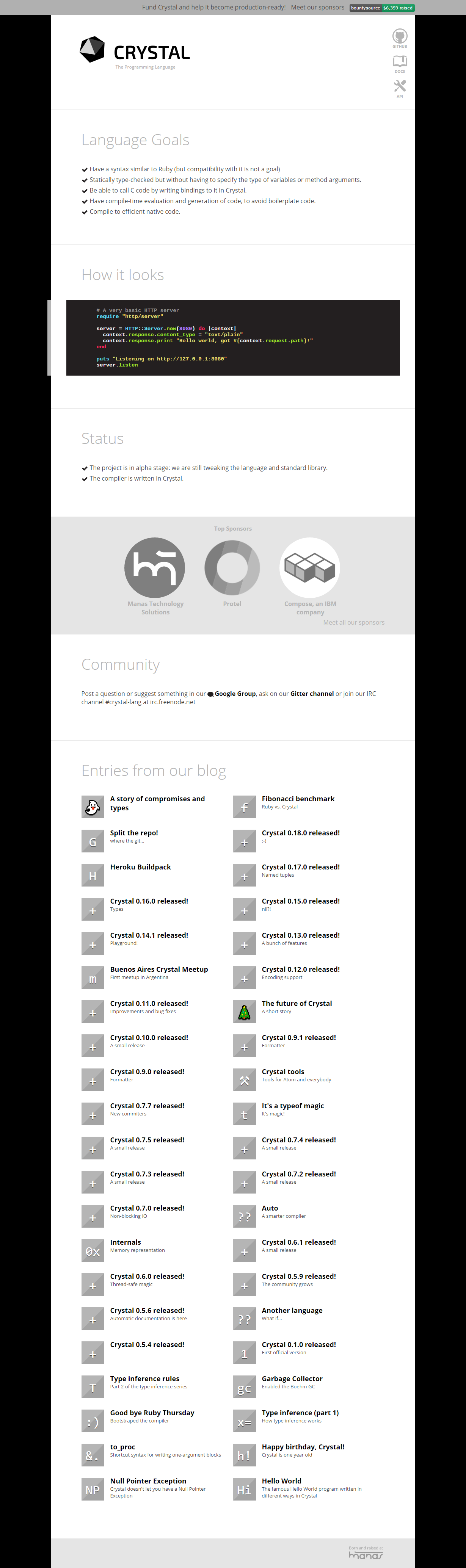
Screenshots for this page will be pretty long, sorry!
Crystal's original webpage and critiques
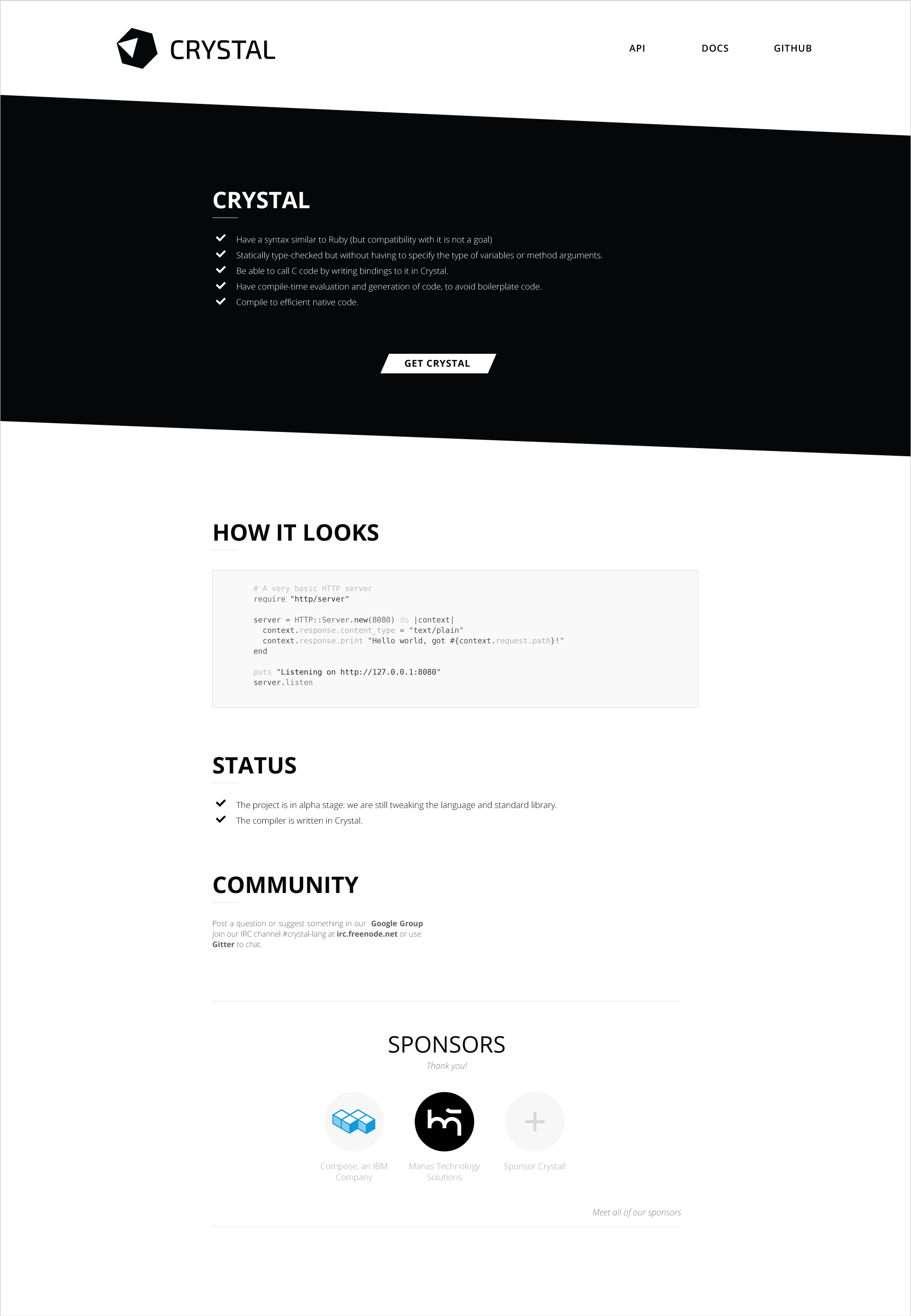
Here's a current copy of the webpage on archive.org, in case the website is changed in the future.
https://web.archive.org/web/20160820115808/https://crystal-lang.org/
Let's take a look at what we can improve upon aesthetically and usability-wise. Please note, I'm going to be focusing on stuff to improve. There's certainly good qualities about the website as it stands now, but I am giving a critique and a proposal, so positive remarks aren't entirely helpful.
Hover over each point to see a brief comment. After the image I provide more in-depth detail on my observations.
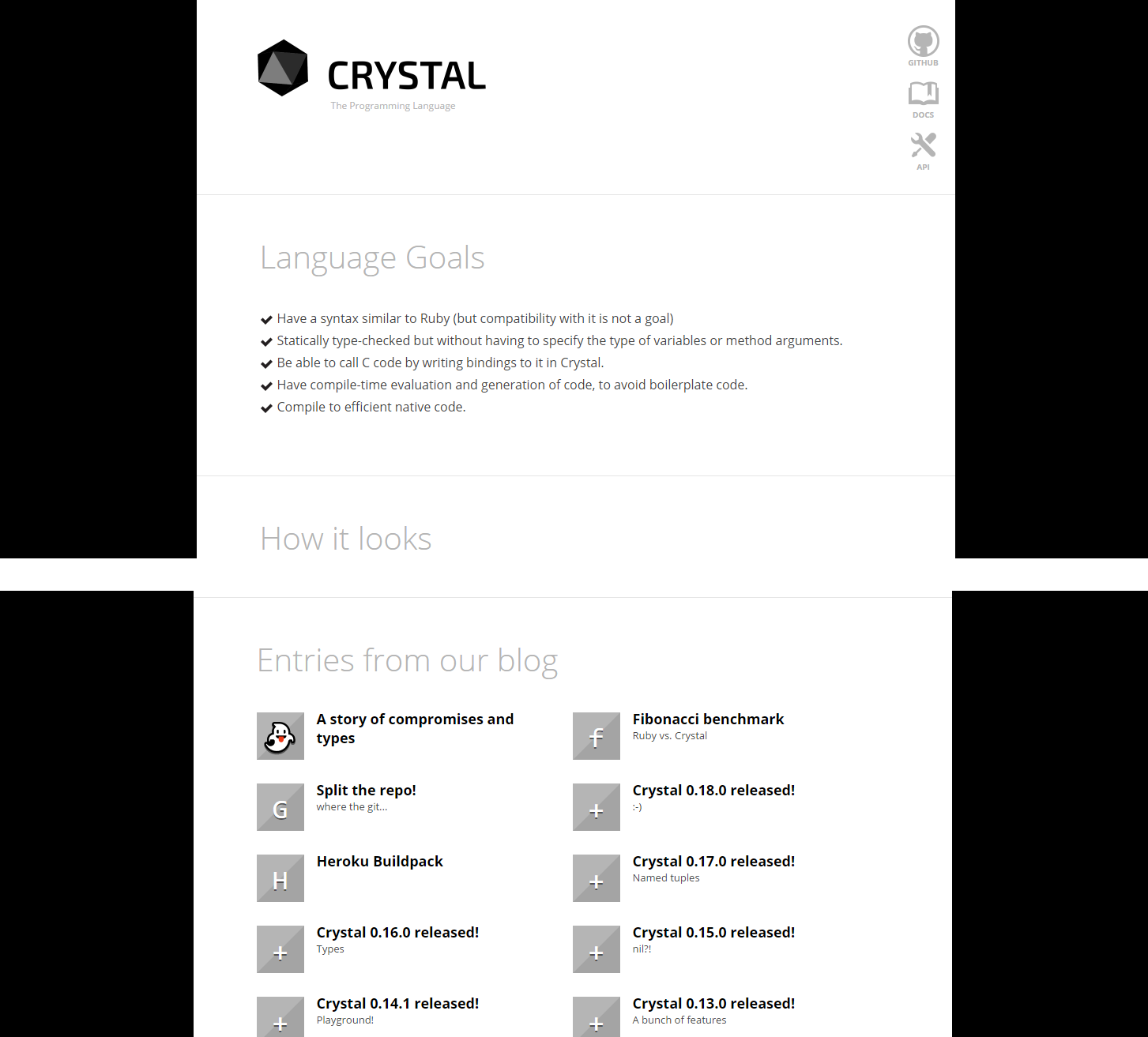
Hierarchy
The site suffers from poor hierarchy. Very low-contrast headers present readability issues, and do not capture the attention of the viewer.

In this example, the "How it looks" header is completely skipped over in favor of it's bolded, black content. When scanning a webpage, most readers will completely skip the main form of organization on this page - headers - and jump straight into body copy.
Sponsors

Here, the "Top Sponsors" section is huge - bigger than all other content on the page. Sponsors are incredibly important, but should not dominate content. We can fix this in a couple ways - we can either make the sponsors section smaller (not good!) or we can find a way to separate the sponsors from content and give them their own place on the site (good!).

The Verge gives us a more exaggerated example of this problem, with a gigantic advertisement across the top of the page. Although important, what does this say about the website's attitude towards the consumer? UI should always feel like a friendly and respectful conversation.
Proportions
Crystal's website stays mostly consistent with typeface choices, allowing for a predicable and enjoyable rhythm. However, blog posts at the bottom of the site look out of place because of their huge margins, large text, and grey thumbnail boxes.
Color
Of in design one will be told to never use pure black or white as it can be straining to read. However, I believe that the pure black color is almost like a Crystal trademark. If I think of Ruby, I think of red. If I think of Python, I think of blue and yellow.
Crystal's accent color is black, meaning it should be used only for emphasizing content. However, the current website has gigantic black margins that create undesirable visual tension.

Visual tension focused on the edges of the page, as opposed to the content
Lowering the contrast of the background can immediately help resolve some issues without detracting from Crystal's visual style.
While still not perfect, emphasis is now on the content
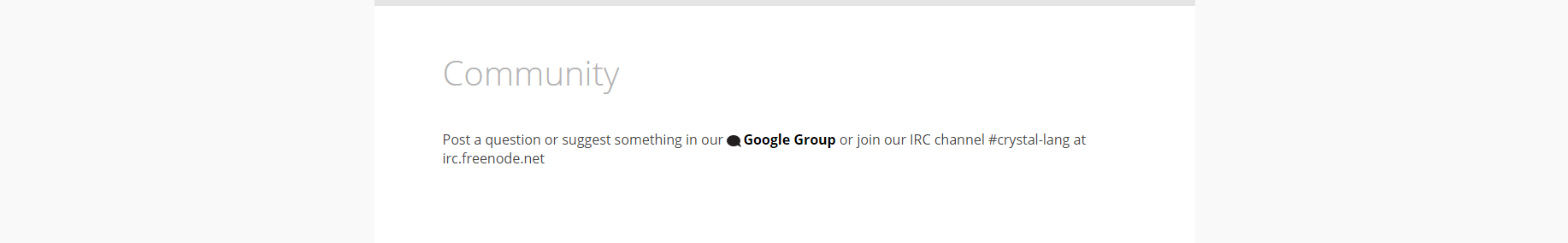
Usability
Perhaps most detrimental, Crystal's webpage is not easily accessed on mobile devices.

This is by no means an in-depth look at every element on Crystal's homepage, but an overview on the biggest issues.
Learning from other sites
Let's take a look at other programming-based website homepages to see how they solve common problems.
Ruby

Aesthetically, Ruby's homepage is not too impressive. However, it has a strong visual hierarchy. The first element visitors will see is the huge, red "Download Ruby" button. We can assume from this that most users who come to Ruby's webpage are there to install the language. At the top of the page, we have links on everything Ruby programmers might want to know about spread out in a predictable and orthodox pattern.
Notice that Ruby also uses a red accent sparingly and strategically to highlight the most important information.
Swift

Swift, being born out of Apple, has a different feel. Swift is presented like a product, and language features are highlighted much to the same effect as a MacBook or iPad. Although it's easy to scoff (especially at Apple!) and assert that a programming language shouldn't be treated like a shiny new Apple Watch, Apple's methodology is part of the reason that Swift got popular so quickly.
In a sense, we are selling a product. We are asking people to adopt Crystal or contribute to the project.
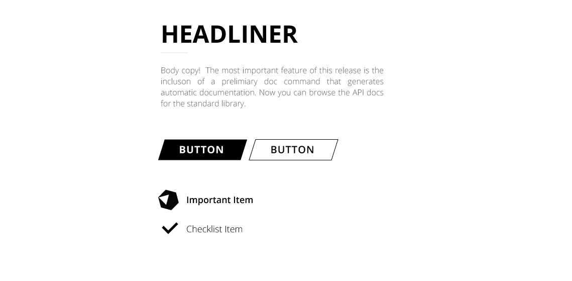
Ideas
Crystal has a very unique aesthetic where pure black is an accent. We can use this simplistic and clean style to create a very graphic feeling.
Here is an example style sheet for common elements.
Page Examples
Consider right-clicking the image and opening it in a new tab to see it full resolution.
More to come:
I still haven't figured out what to do with blogs, but I think image banners with custom illustrations would looks really cool! That does require some upkeep, though...
The design above is very much a first iteration and can use a lot of work. But I think the essence of my idea is there, so I'll keep progress updated.
My Goal
I would like to finalize these designs, and make a pull request someday to the Crystal website if they are interesting in a redesign of the site.